

Our initial meeting with the client was to sort out all the nitty-gritty of the project: Goals (both aesthetic and financial), project timeline, inspiration, wants and needs… this is the part of the project where we ask a lot of questions and listen closely to each answer. Once the meeting was wrapped, we felt prepared to begin the design process.
The Problems:
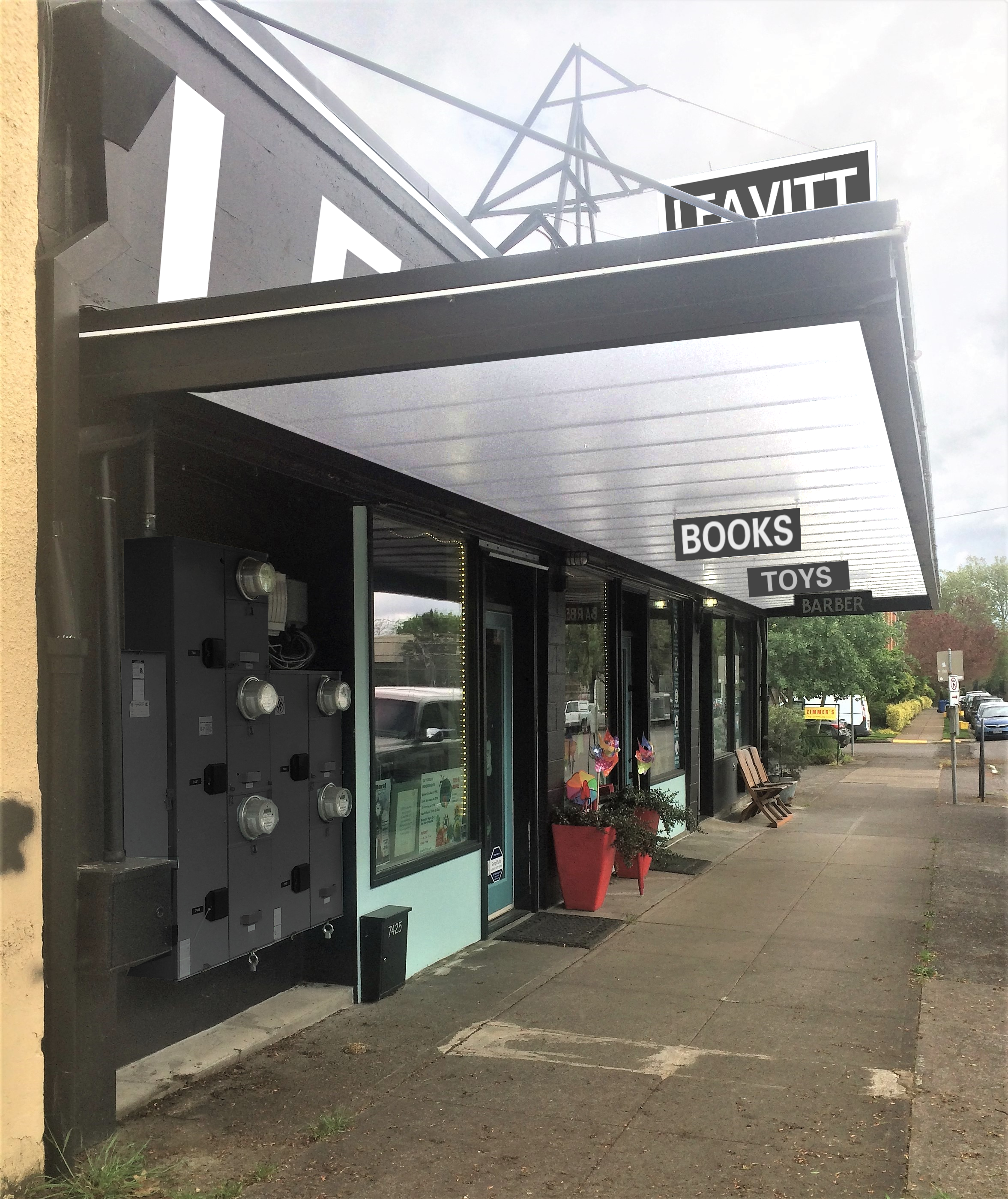
- The building is dated and needs to be updated
- Under the eave is very dark, especially in winter
- The Utility Bay is an eyesore
- There’s nothing to brand the building
Project Goals:
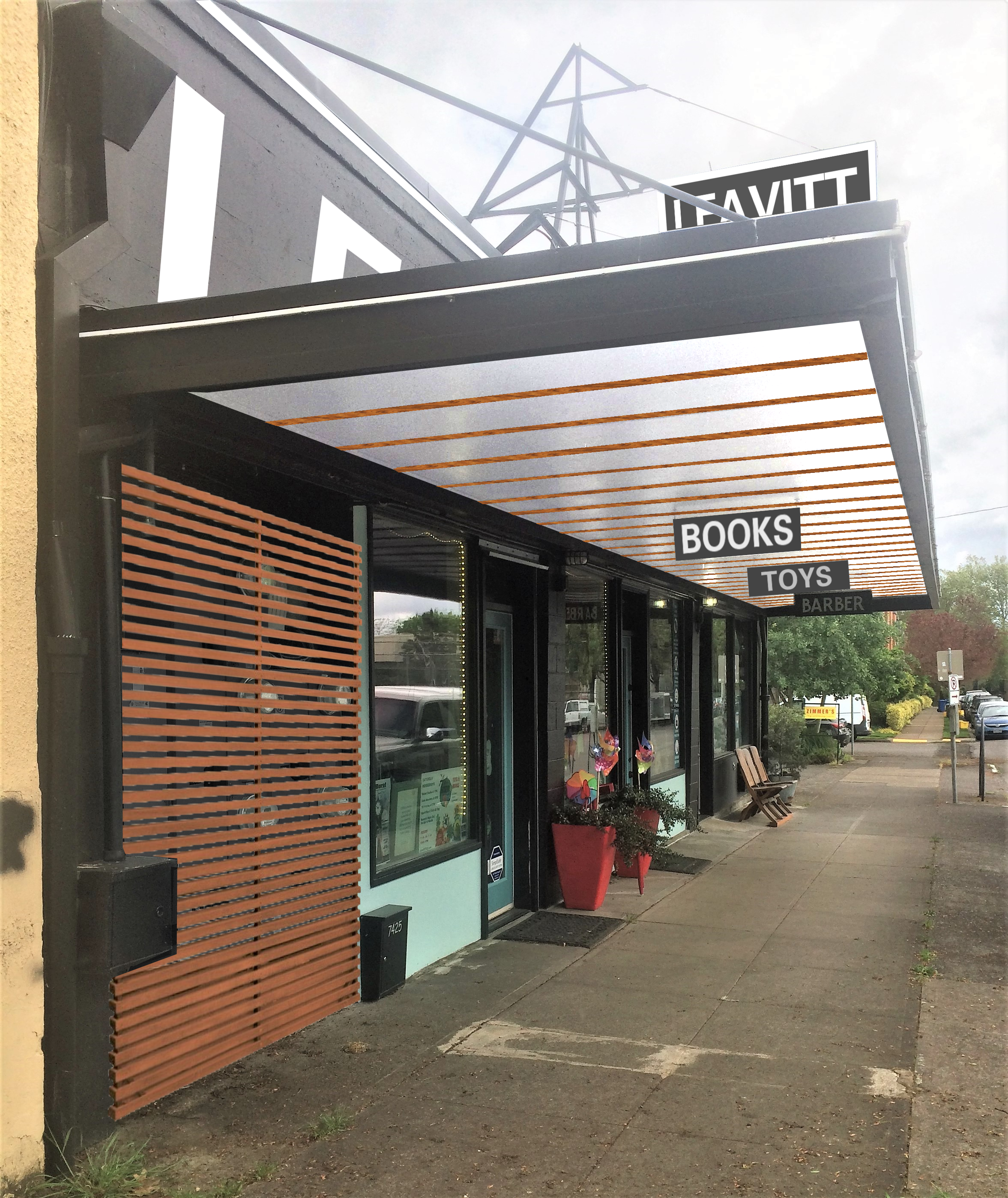
- Improve the look and function of the eave- add sustainable wood?
- Minimize the appearance of the Utility Bay
- Add “Leavitt Station” to highlight the building- both for branding and place making
With this, we created three design options.
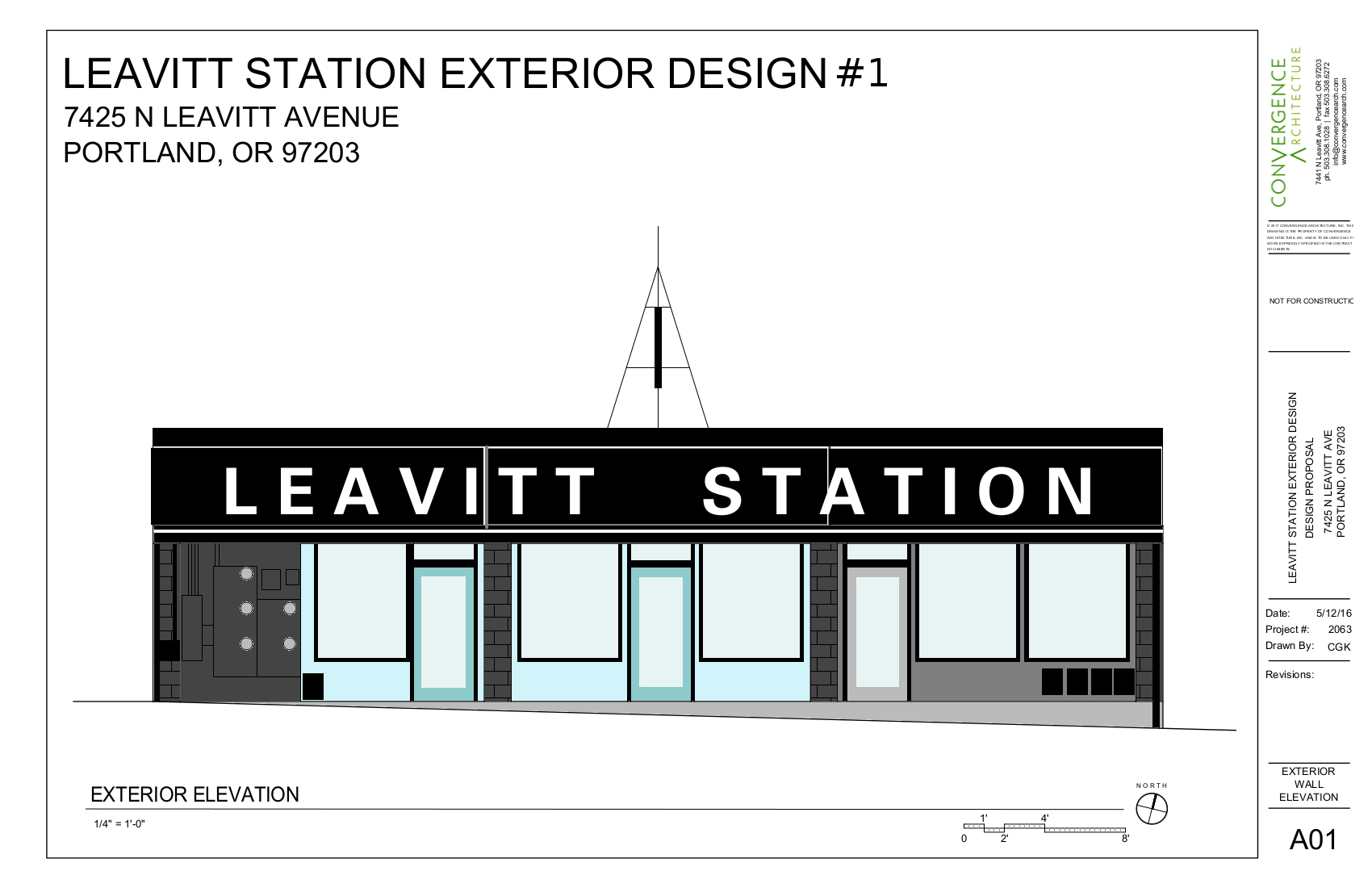
Design #1 was the lowest cost approach: using paint to make the most changes. The under eave would be painted a bright white (to spread light) and the utility bay would be painted dark to make it visually recess. The existing roof-top sign would be redone and a new painted wall sign would be added.
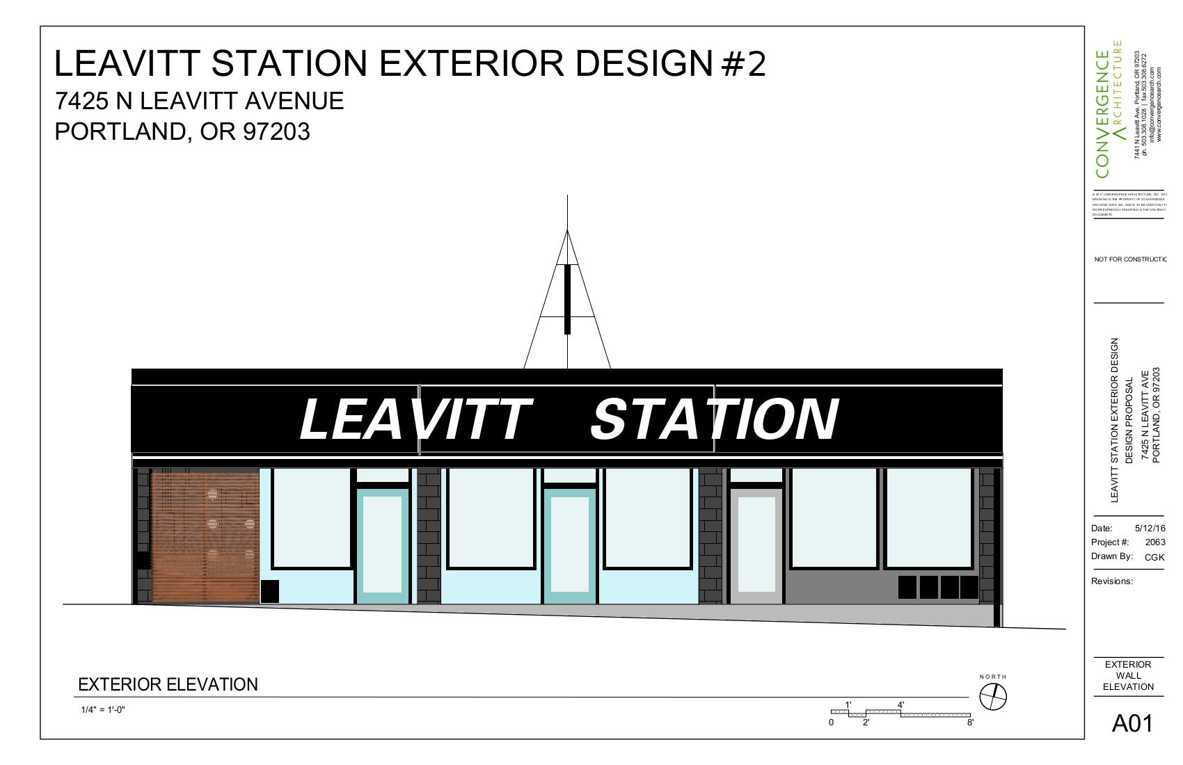
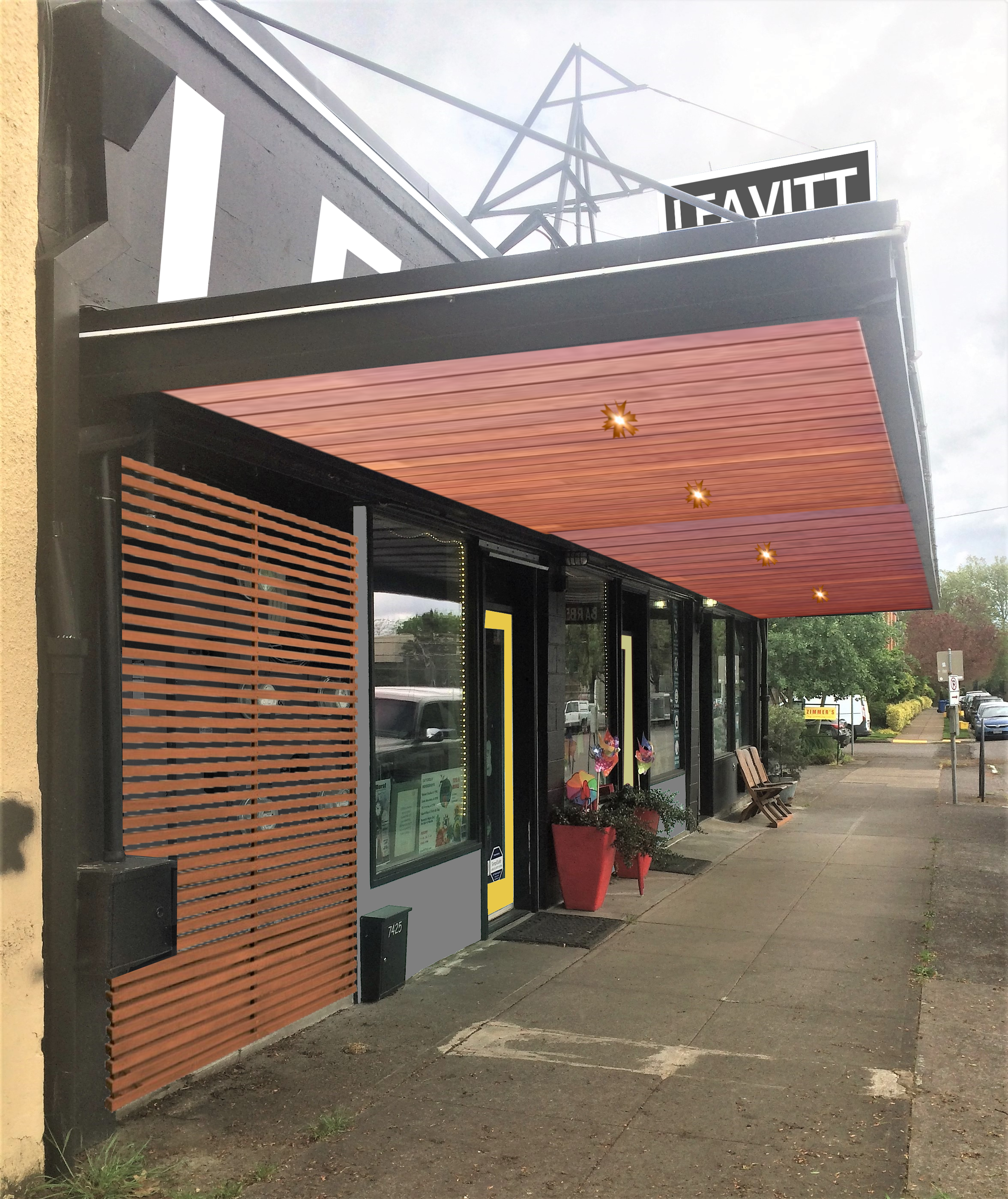
Design #2 was the mid-grade option: Using sustainable wood to add visual repetition to the under eave, and cover the utility bay with a screen to add warm wood to the facade and hide the utilities. The existing roof-top sign would be redone and a new painted wall sign would be added.
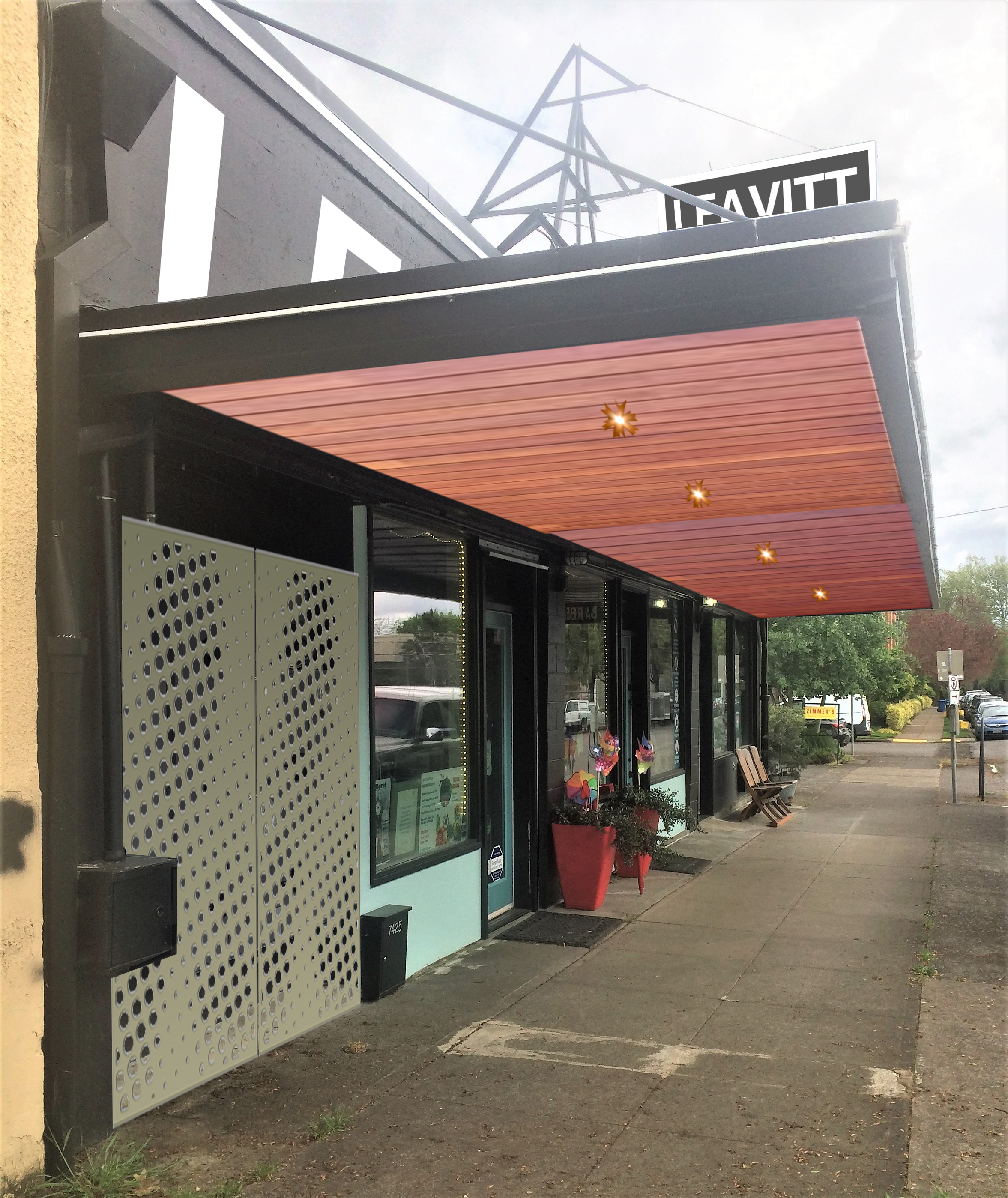
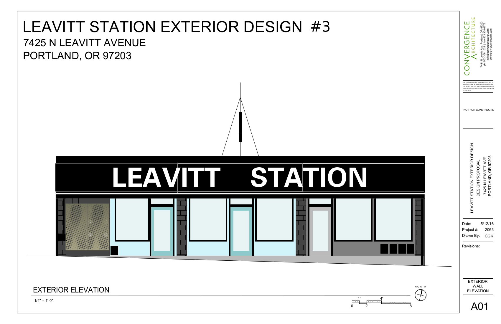
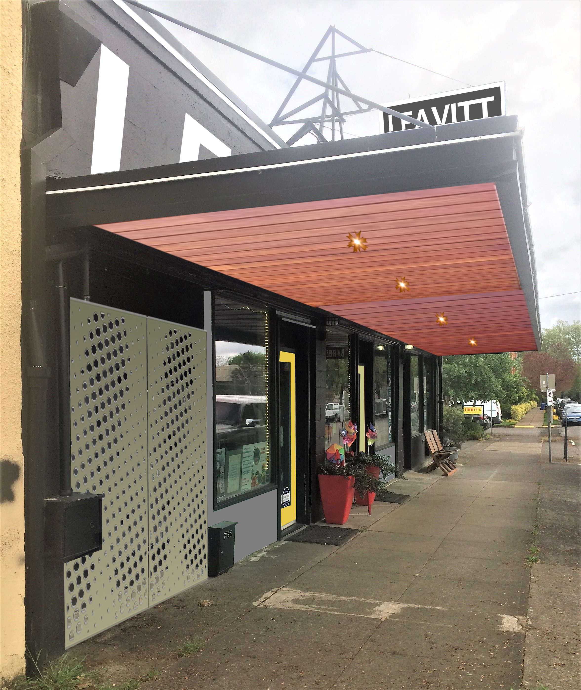
Design #3 was the most expensive of the upgrades: Glad the under eave with sustainable wood, add lighting and fabricate a custom metal utility screen (which could add color and a new material into the mix. The existing roof-top sign would be redone and a new painted wall sign would be added.
We met once again with the clients to go over the conceptual designs and discuss pros/ cons/ others of each.
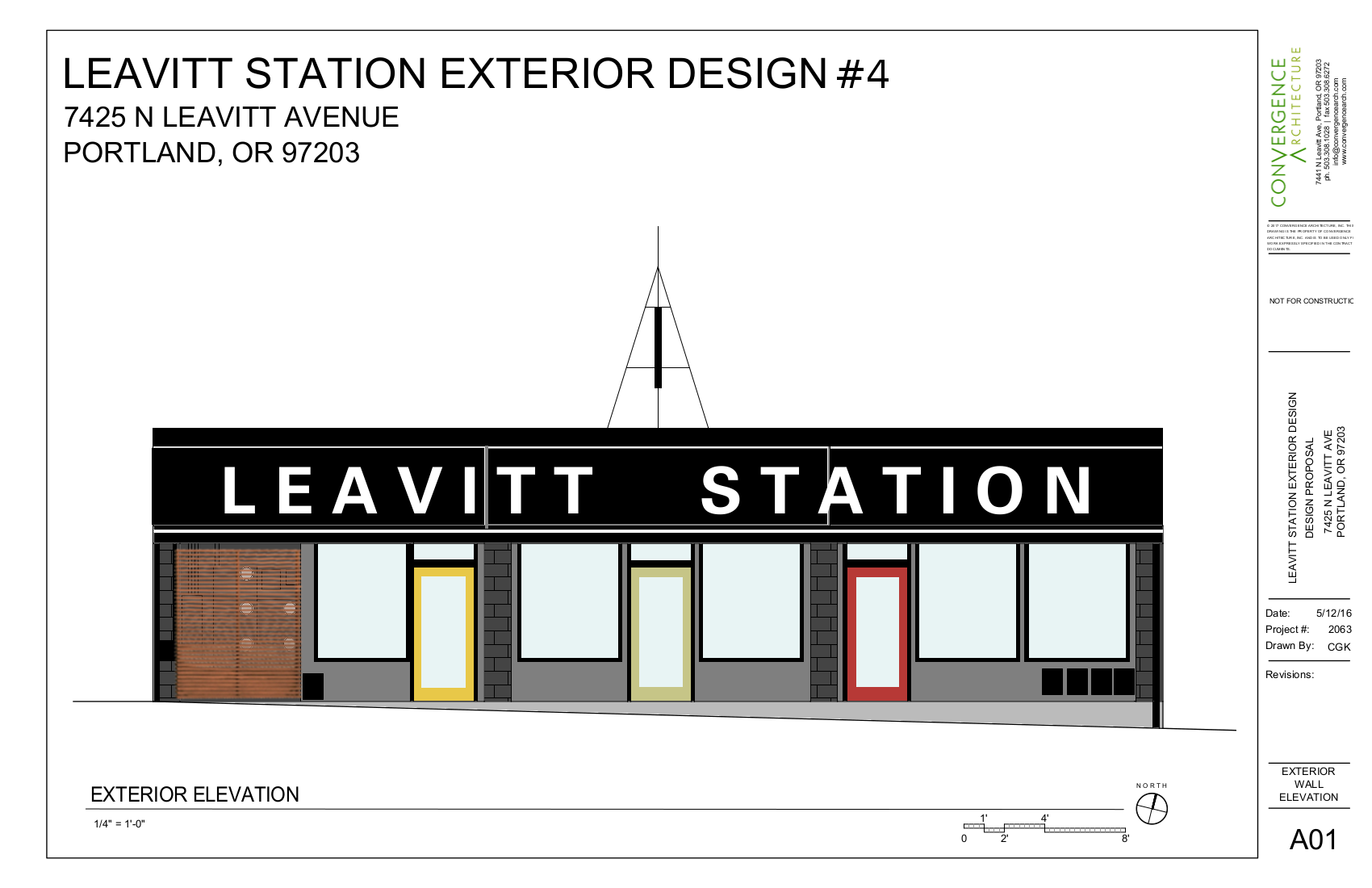
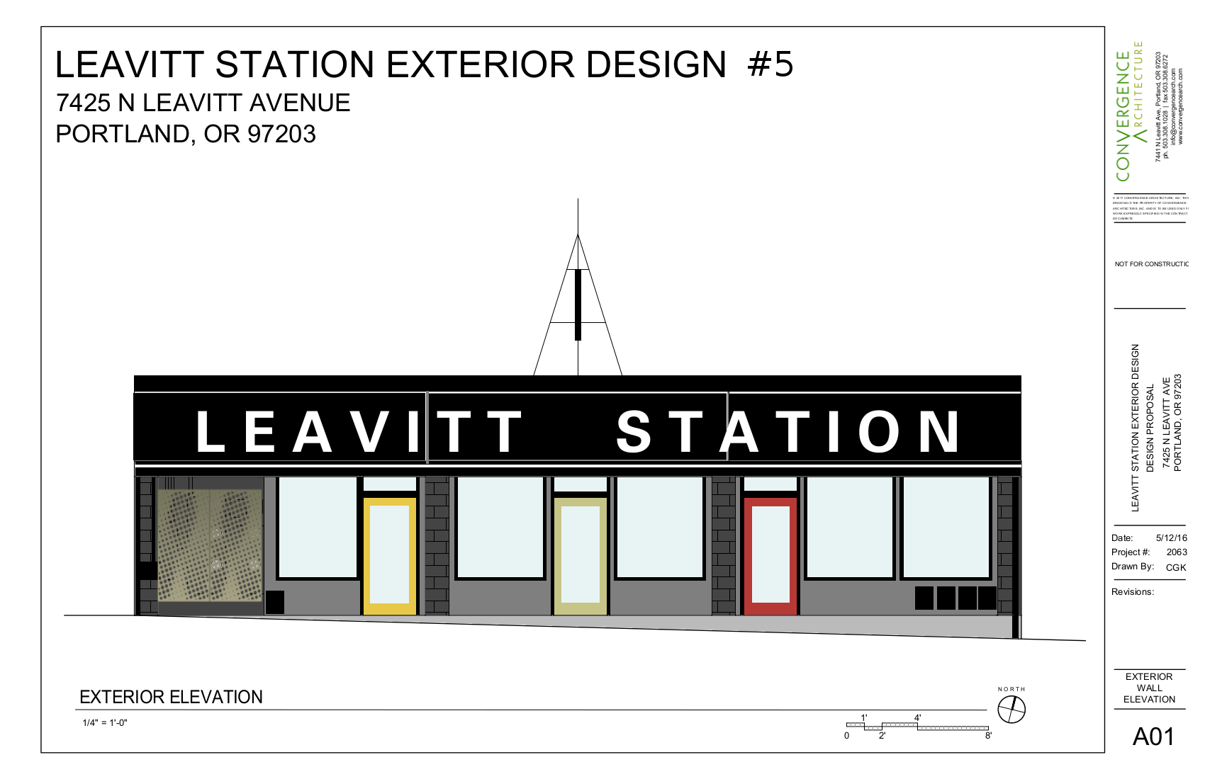
Through the conversation, there was interest in creating greater continuity in the color palette of the building. It was discussed that spreading the dark, moody and modern grey across the entire facade would be a nice change visually, and it would also offer the owners more flexibility in meeting tenant needs (in case the composition of store fronts/number of tenants should change in the future). We took inspiration from the colors on the other side (Kellogg St) of the building -a golden yellow, maroon red, and olive green- to add “pops” of color that would highlight the door locations and break up the grey with a bit of freshness.
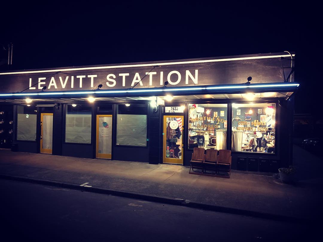
The painted wall sign was really well received and exactly what the client had hoped for. There became an interest in providing light to improve the visibility of the wall sign. As we narrowed in on the favorite design elements, we revised our visual aids to help the clients to decide what they would like the finished product to be.
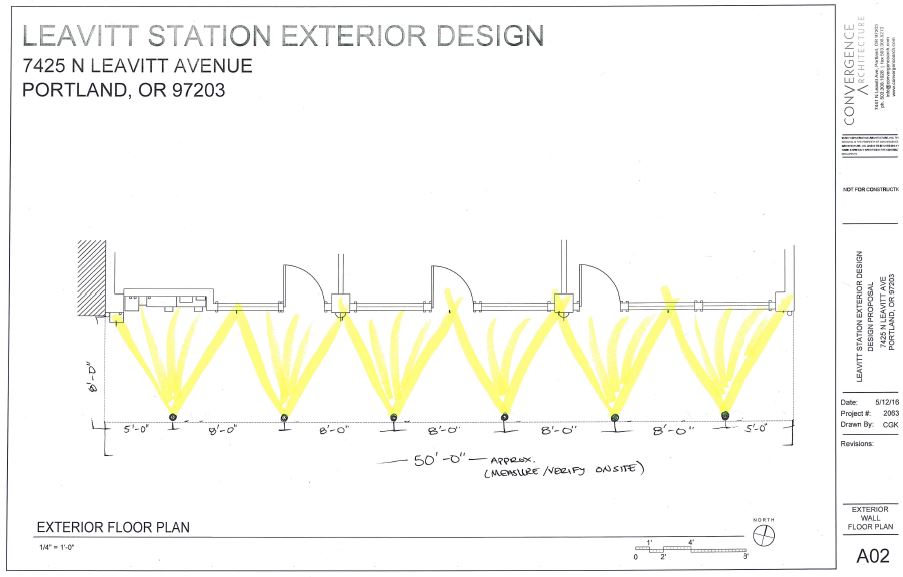
Once the design was narrowed in, the real fun began- preparing our permit plans. When we went into the permit center, we learned that the exterior design required meeting applicable zoning, sign, and design overlay requirements… which becomes tricky when you are also trying to meet the owner’s goals of achieving a fresh, clean, and modern facade.
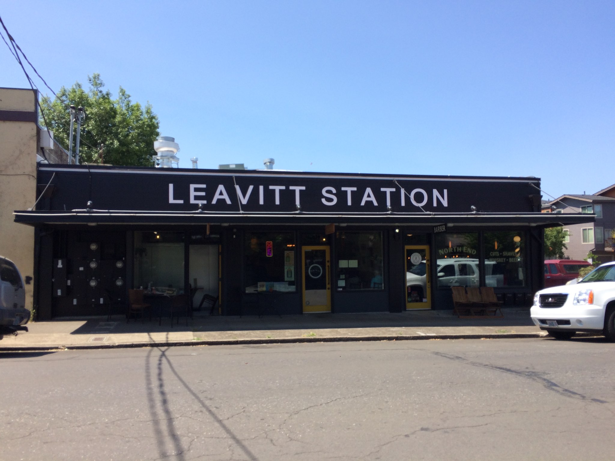
Because there was an interest in managing cost and time, we opted to avoid a structural review- which meant the under eave cladding went away and fresh white paint was used instead. This saved on the materials cost as well. We kept the lighting improvements in the design in order to improve the visibility and comfort along the sidewalk. We also discovered that in a commercial setting, concealing a utility bay is quite difficult- especially when abutted to a side walk, which requires accessibility and needs right-of-way standards to be met. So, to meet these requirements, the screen idea was cut in favor of a painted utility bay. Lastly, the large roof top sign fixture had been “grandfathered” in, but it wasn’t something that was up to code and design requirements. The challenge here being that ANY change to the sign would not be approved, but ultimately, it was dated and the owners did not want to keep it as it was. So instead, we decided that it was best to remove the sign and its support structure. Sometimes, the best design plans can end up looking quite different in person… once we had the painters onsite, we realized that the olive green door just didn’t look quite as good as we’d imagined. In response, we chose to paint all three doors the same golden yellow instead.
In the end, the scope of the project changed quite a bit… and the end result was a hybrid of design ideas:
- A painted under eave, with the addition of under eave lighting.
- The Utility bay was painted dark to visually recess and be less of an eyesore.
- The building has been branded with both a new color scheme and a large, illuminated, wall-painted sign.
- In total, the building has been updated and there is improved branding and place making.
It turned out to be a slightly more complicated process than we had originally planned on… but the end result was one that met all of the original project goals and resolved each of the problems that had been posed. Best yet, the client and their tenants are happy. Which really, is what makes these kind of projects to much fun. Best of all, we get to see the benefits of the improved facade on a daily basis; it’s a joy to get to see and enjoy your efforts on a regular basis, it’s a great reminder for why we do what we do.